
BLUU SPRAY
THE HERO OF
HEALTHY HABITS
(BRAND EXTENSION, COPYWRITING, ART DIRECTION, WEB DESIGN) 2026THE BRIEF
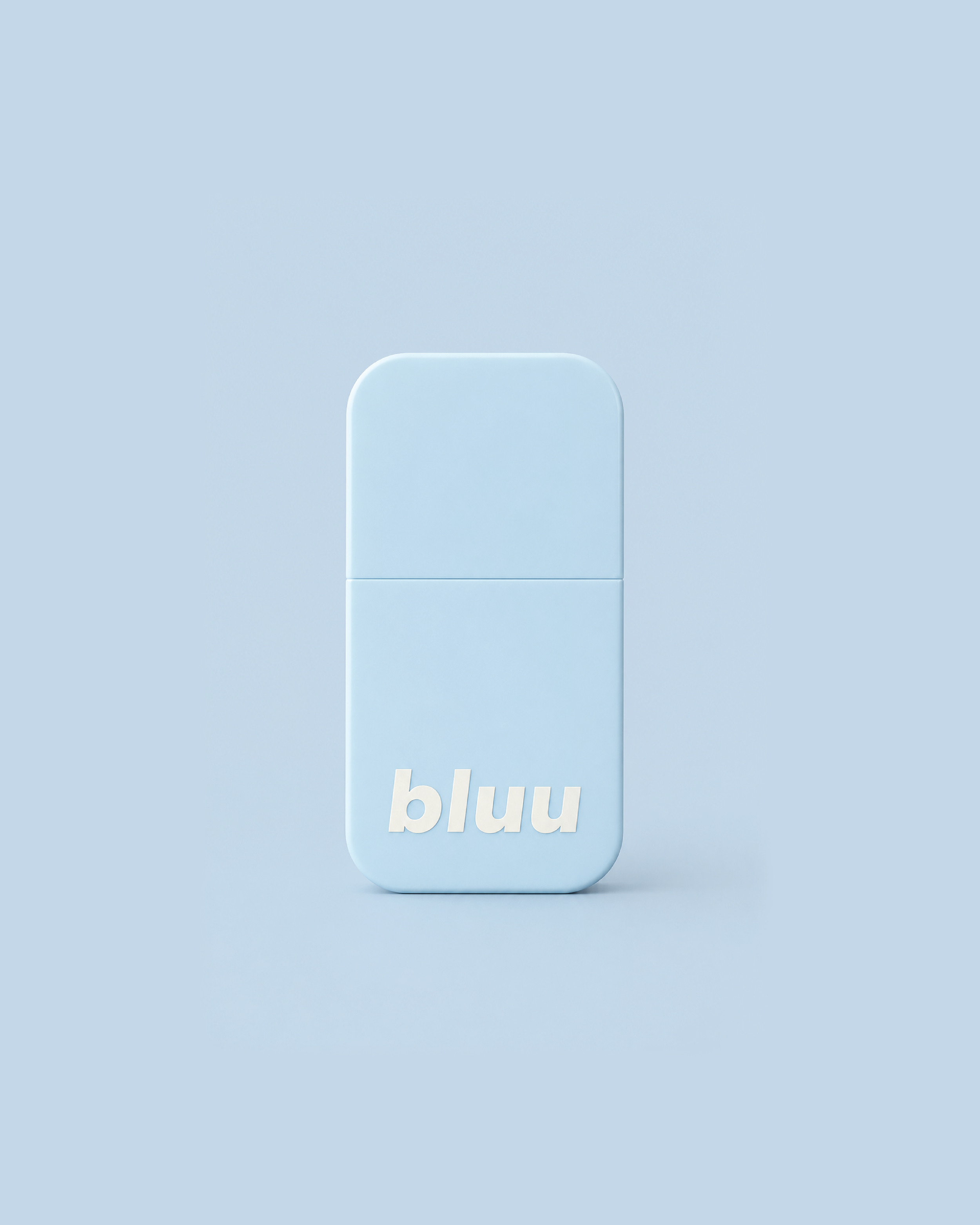
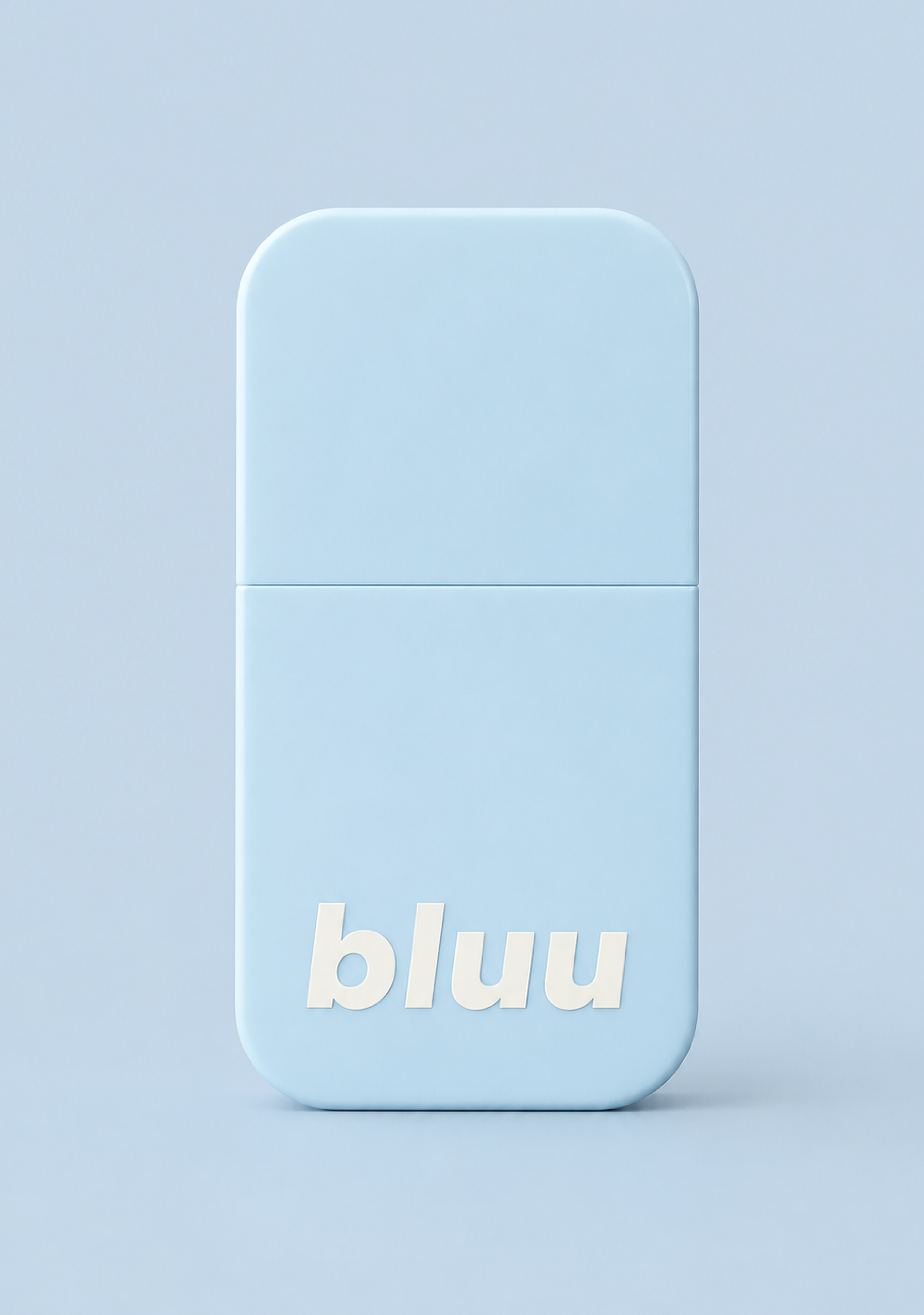
A logo, a blue bottle and a product already in production. That was the starting point when Demi and Mel brought Bluu to my desk. Their question? “Can we still build a brand around this?”
Of course!
An Australian-made habit deterrent spray, Bluu needed a brand that felt reassuring for parents and encouraging for little ones.
THE COPYWRITING
The tone and messaging for Bluu needed to feel encouraging and positive. Breaking a habit can be frustrating for both parents and little ones, so the language needed to feel supportive, reassuring and free from judgement.
Writing for a product like Bluu also means being careful with claims. The messaging needed to clearly explain what the product does while staying within the boundaries of what could be said.
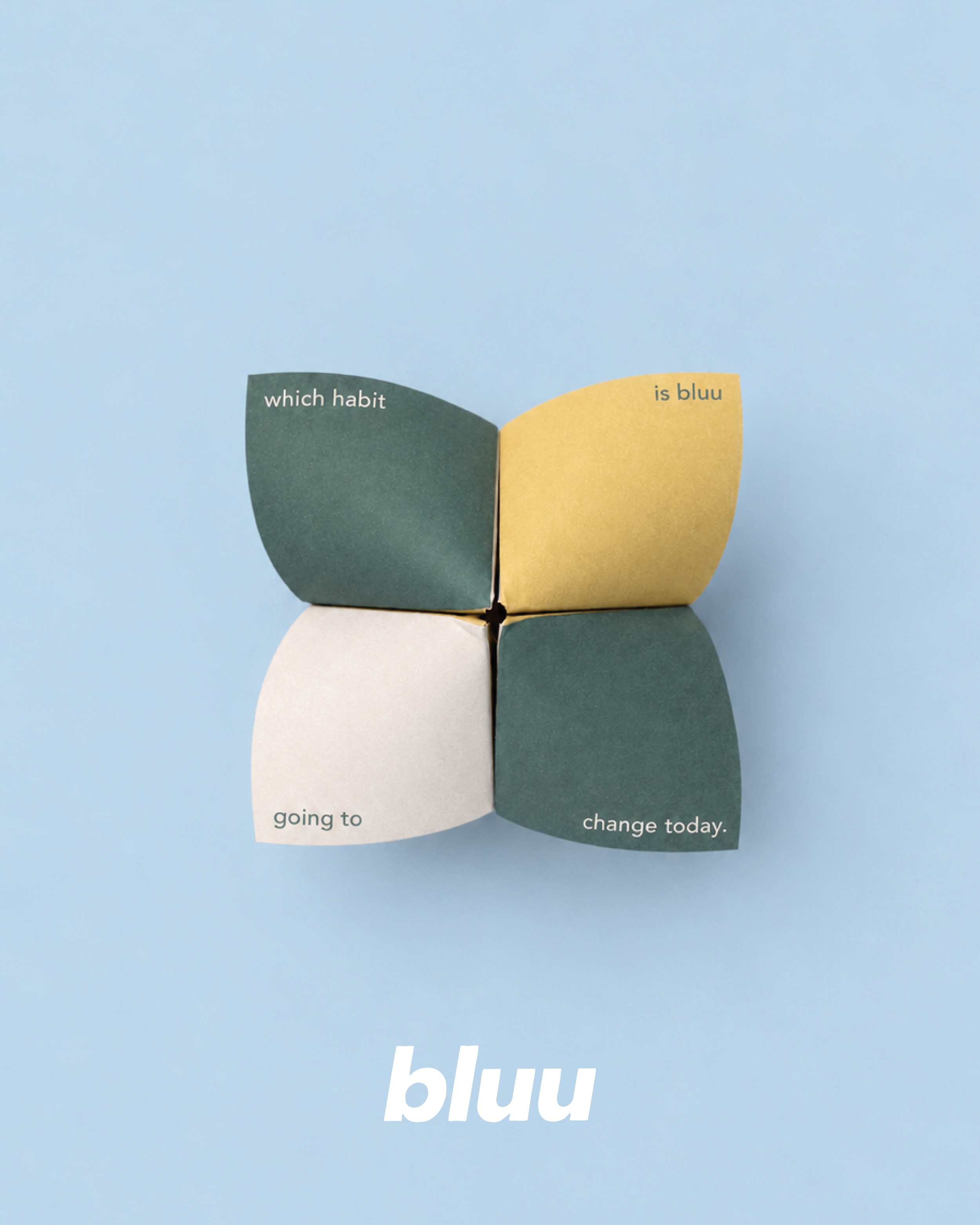
After exploring a few messaging directions and tagline options, we landed on “The hero of healthy habits.” It felt like the perfect way to capture Bluu’s role: a little product there to support families as they work towards lasting change.
THE BRAND
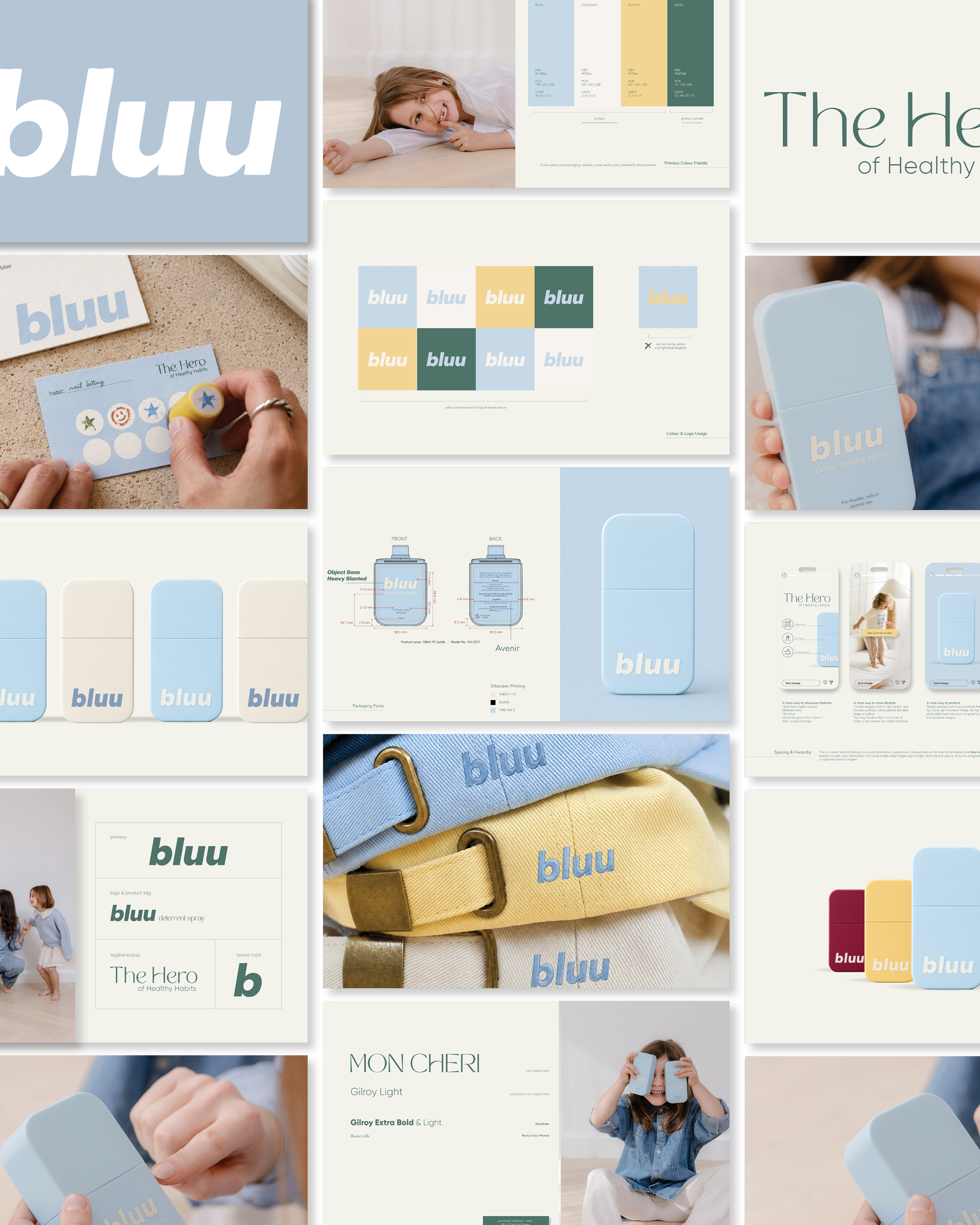
The existing logo and bottle colour gave us our starting point. As a sister brand to Missta, Bluu also needed to share its clean, modern feel while having a personality of its own.
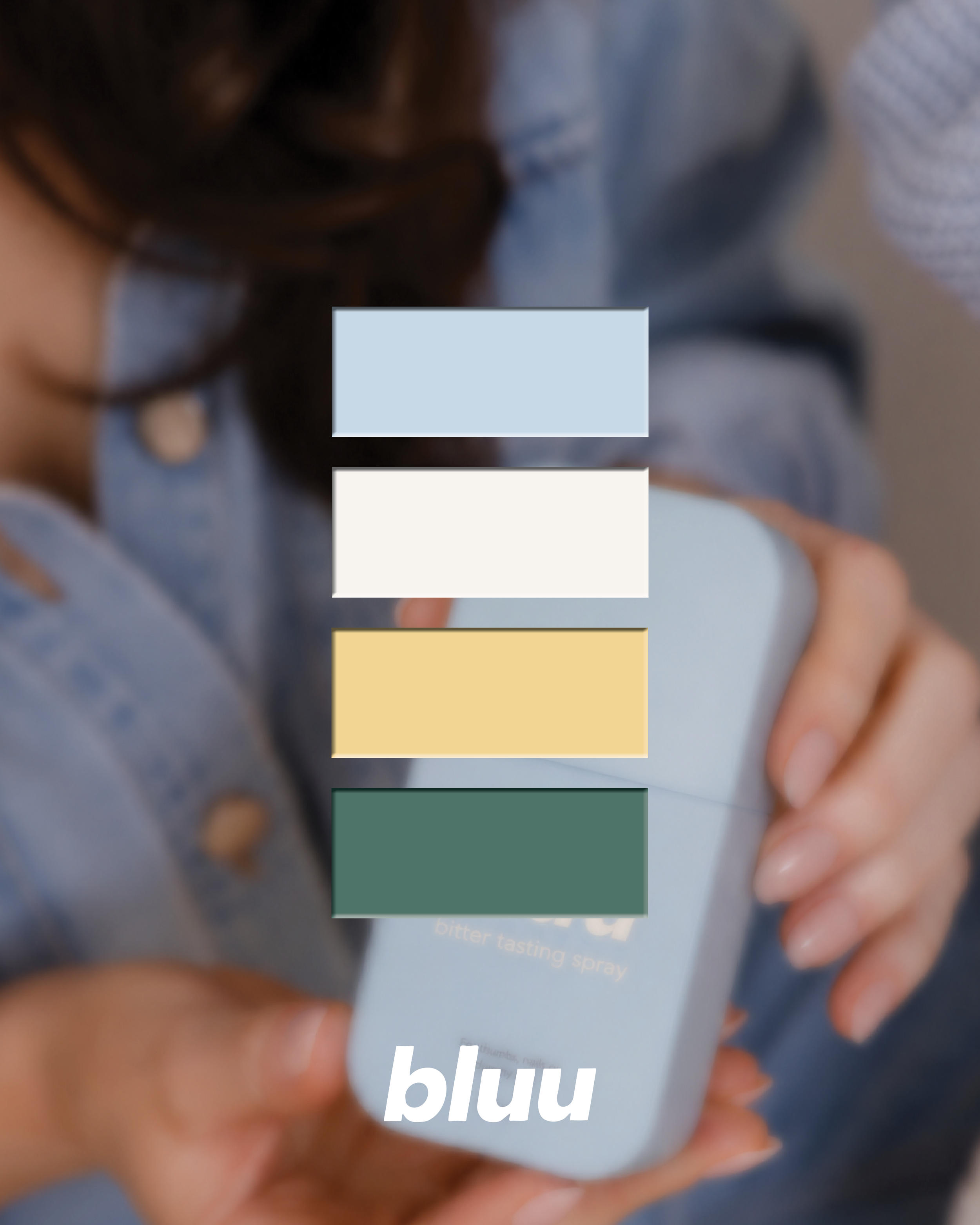
After exploring a few creative directions together (some bright and bold, others playful and whimsical), we landed on the calmest of the concepts. For parents navigating habit change, often with a little frustration or guilt along the way, I wanted Bluu to feel like an exhale to visually cue that parents were in safe hands.
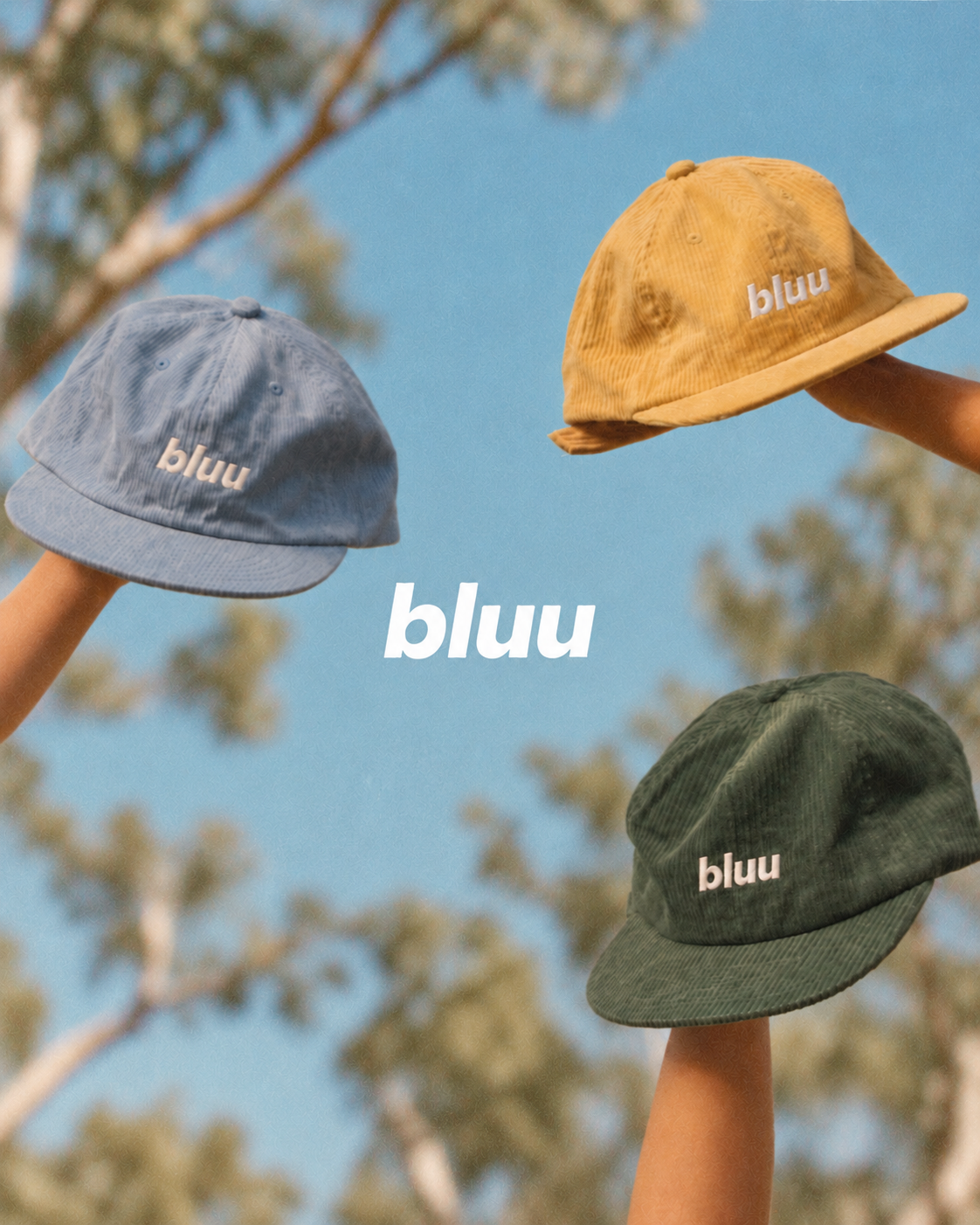
I paired the blue with soft butter yellow and deep moss green, bringing warmth and a gentle sense of play to the palette. The green and gold also offer a subtle nod to Bluu’s Australian roots, being a proudly Australian designed and made product.
THE ART DIRECTION
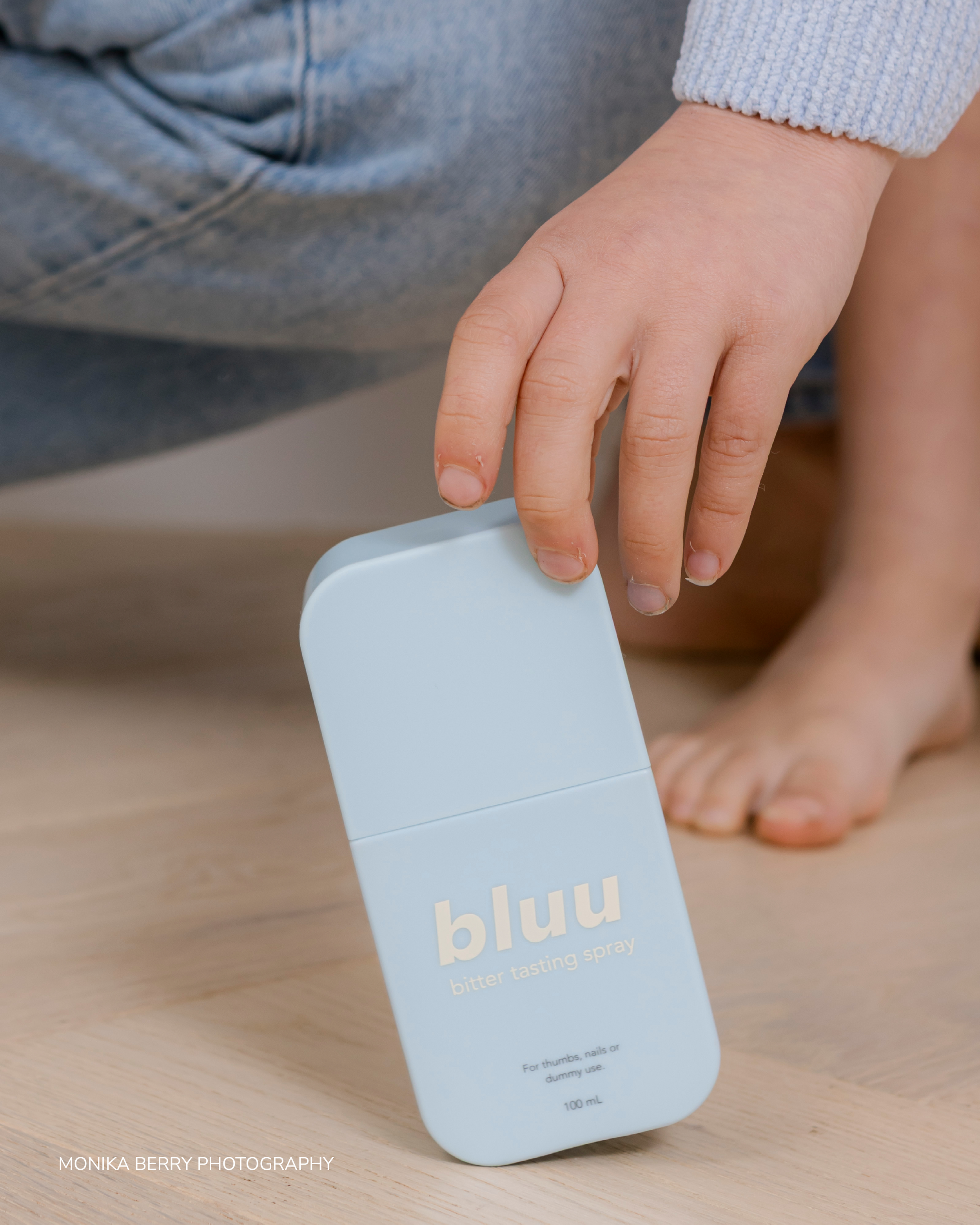
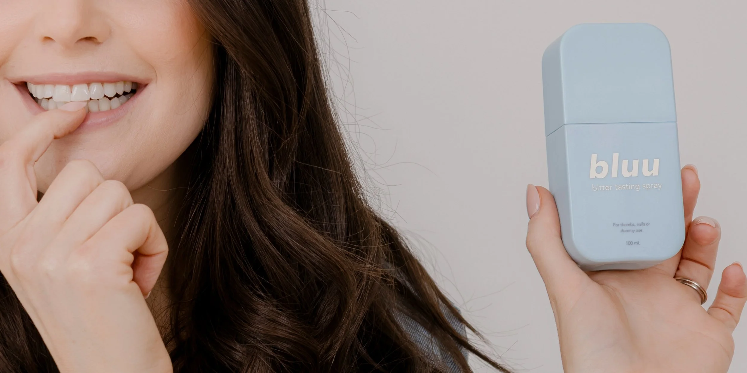
I extended the brand into a visual direction for photography, supported by comprehensive brand guidelines, moodboards & shot lists.
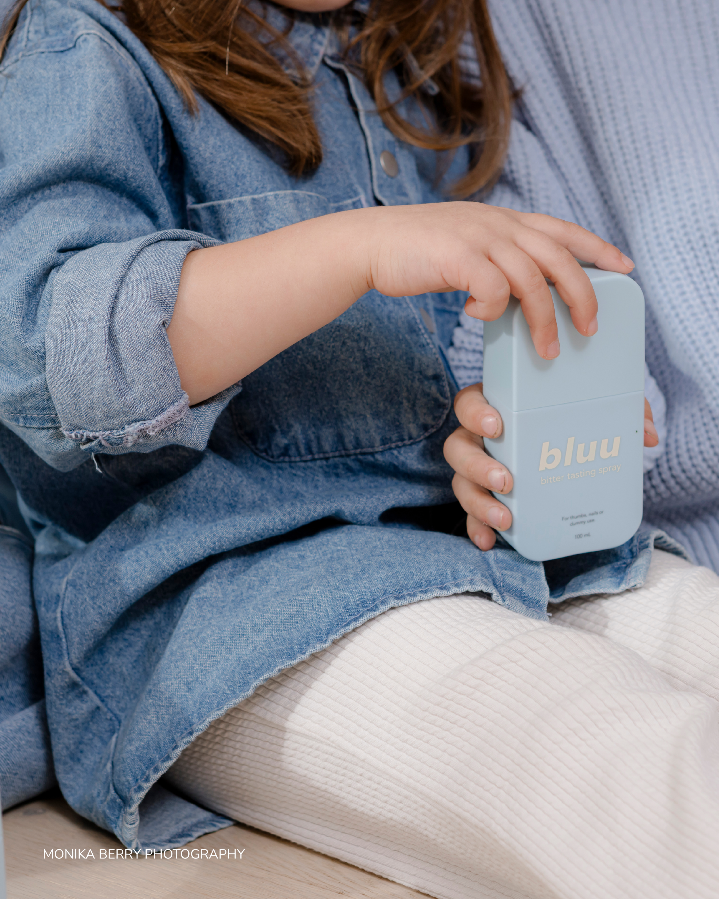
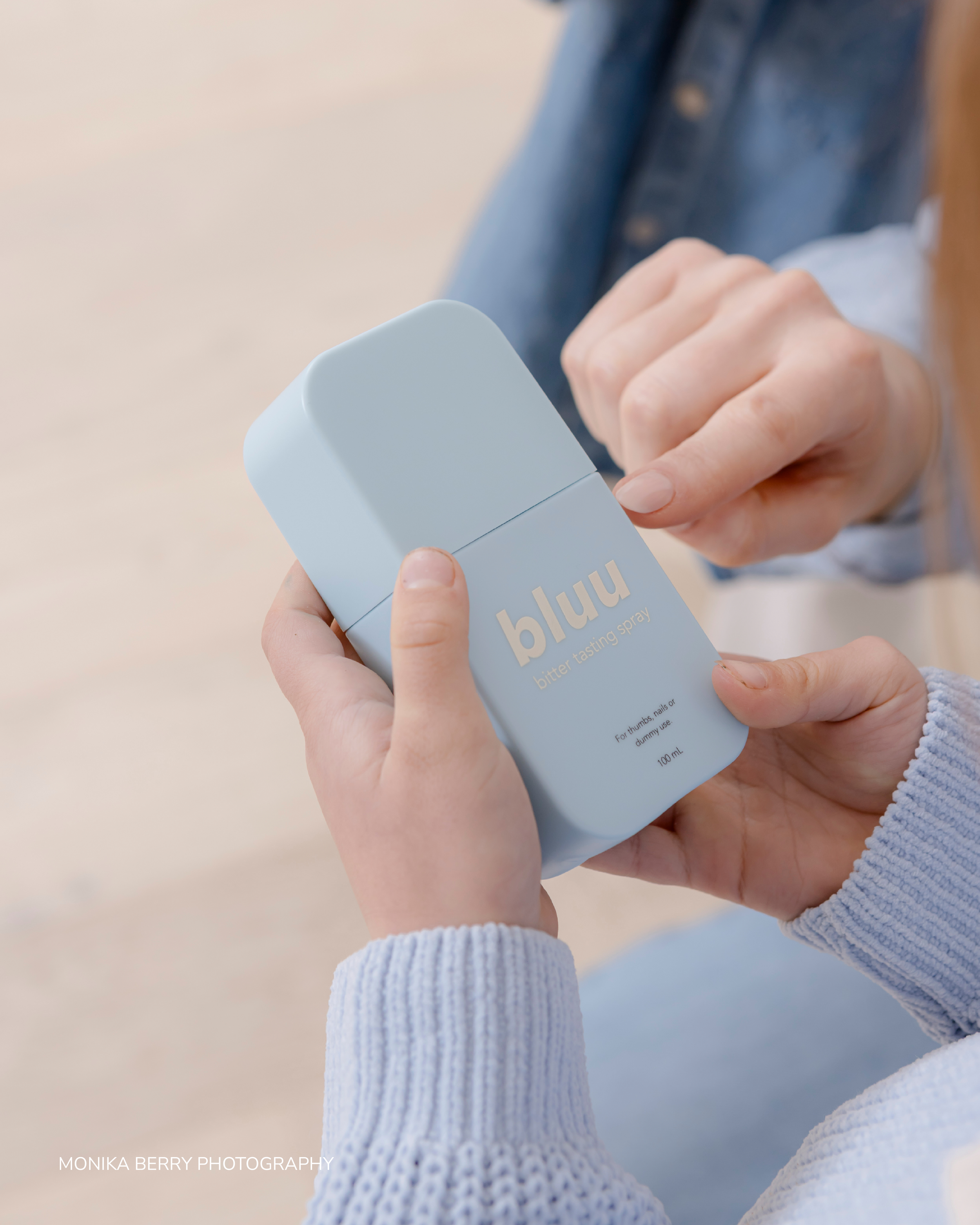
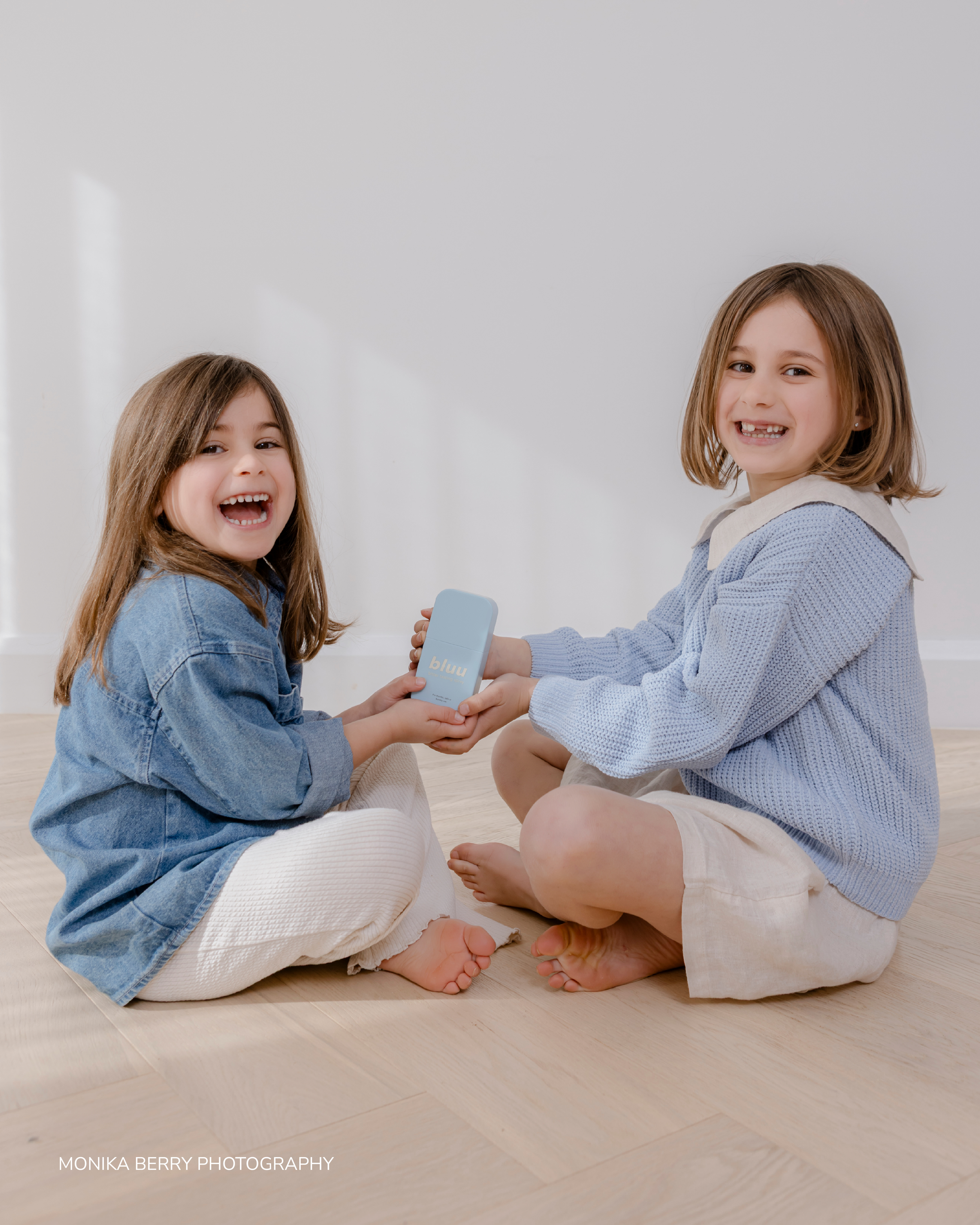
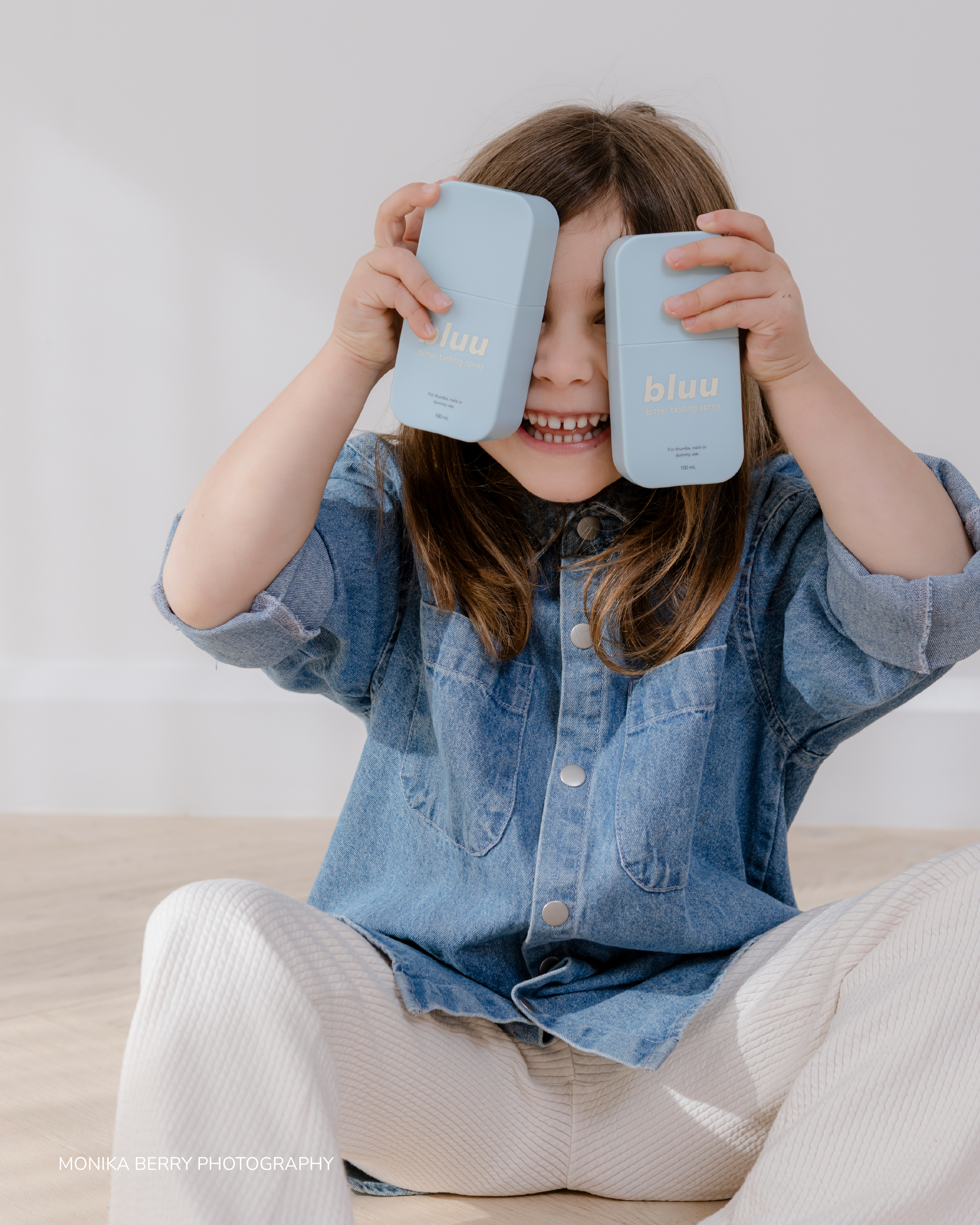
Oat linen, white cotton, pale blue knits and denim created a soft, familiar setting for the product. Natural textures brought warmth to the imagery and carried the palette into everyday family life.
Photography by the talented Monika Berry Photography.
THE WEBSITE
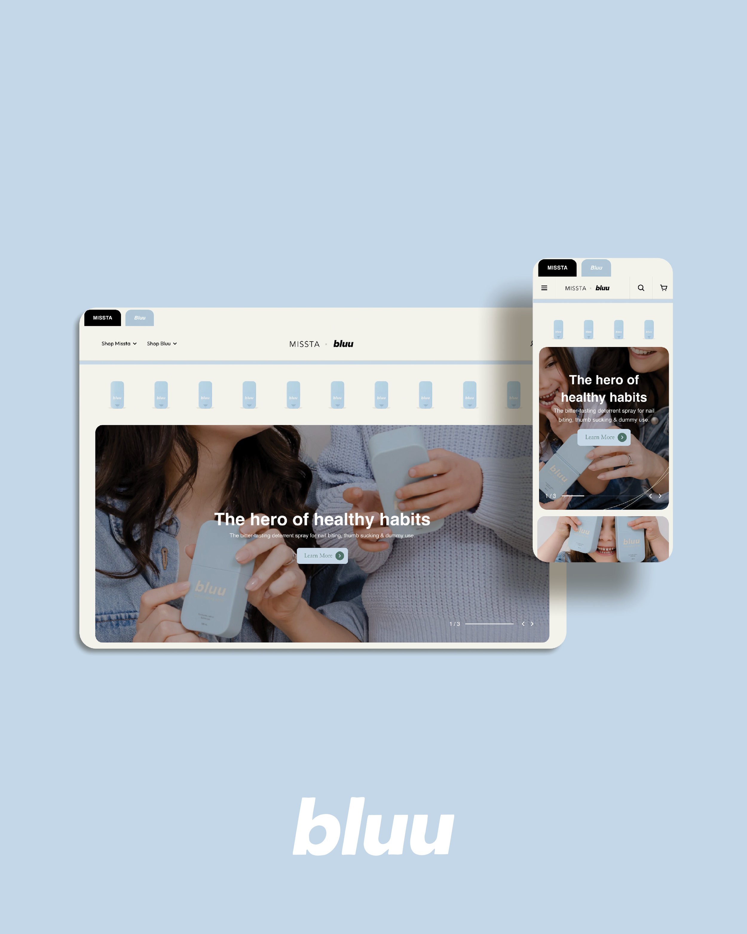
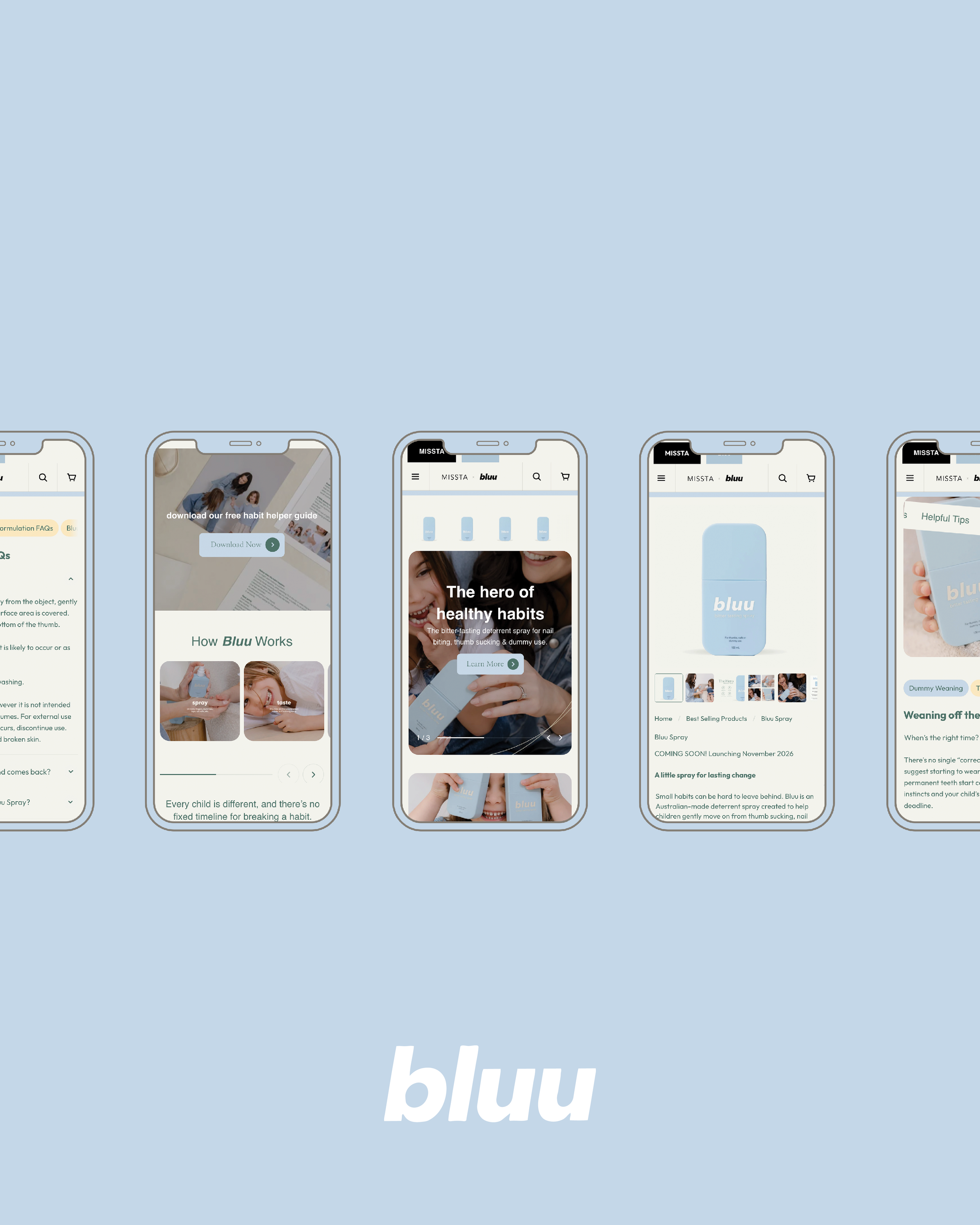
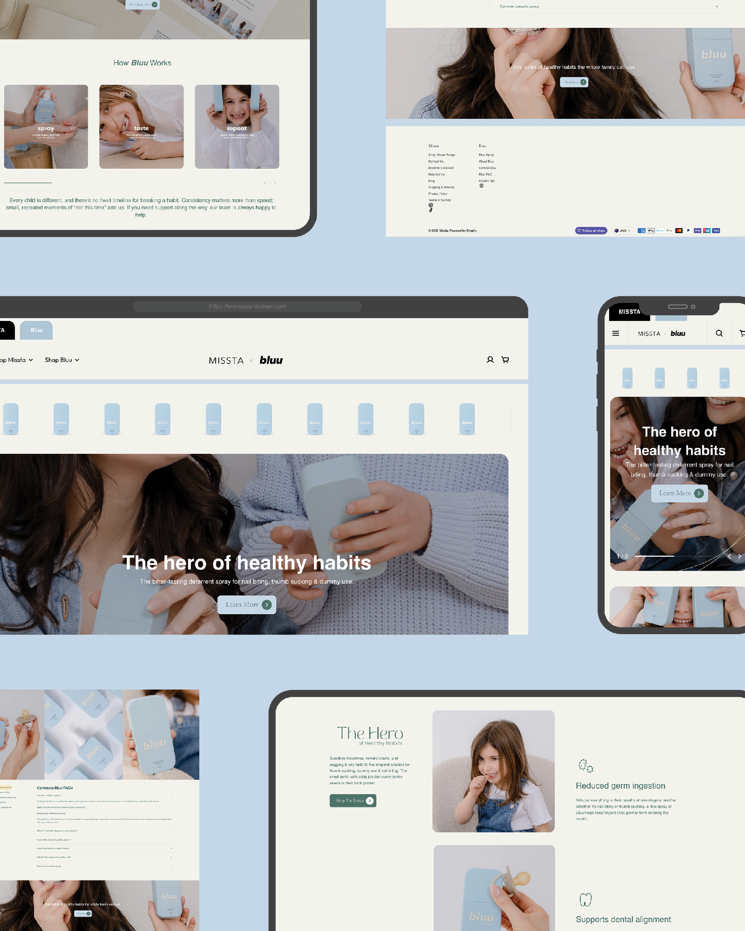
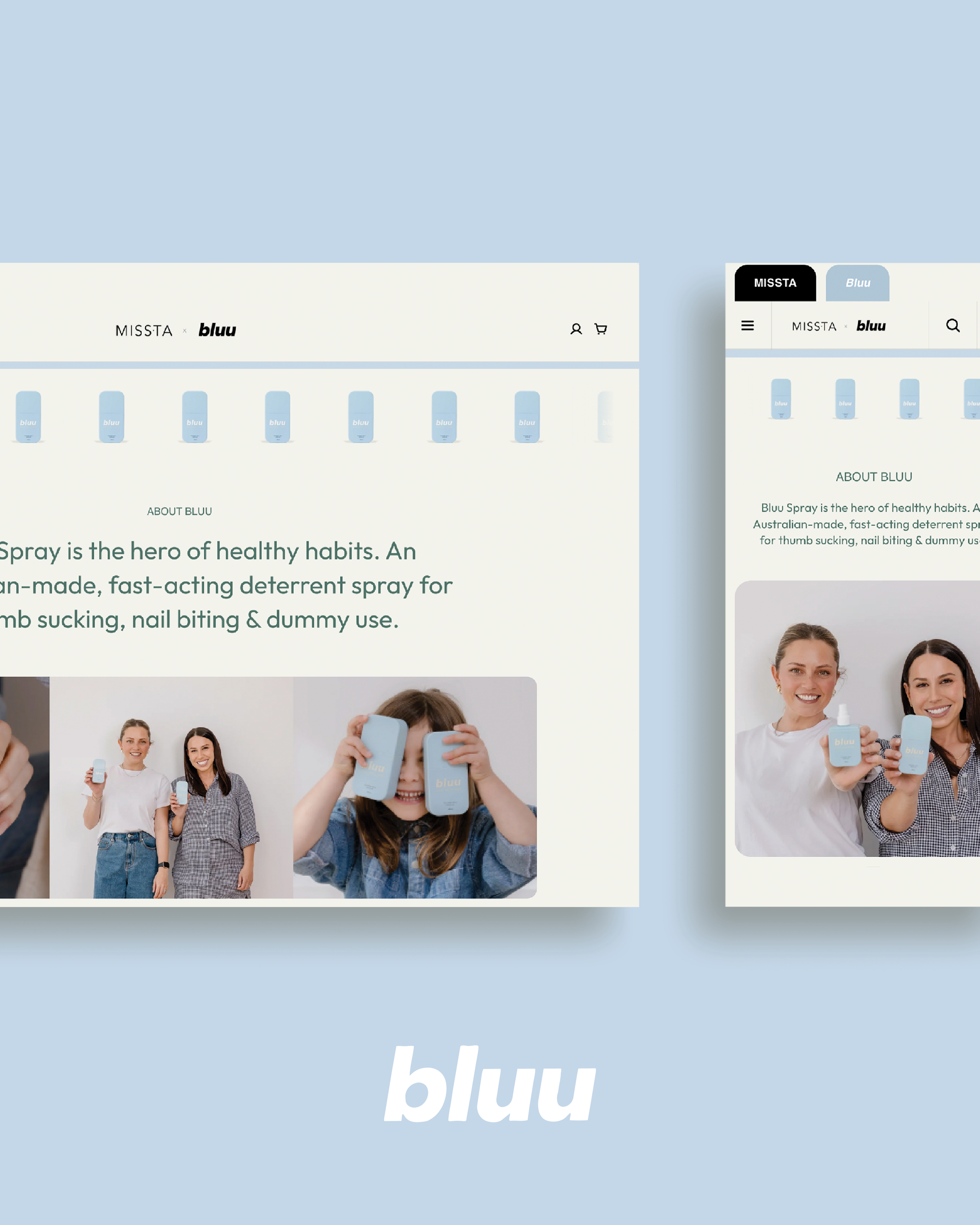
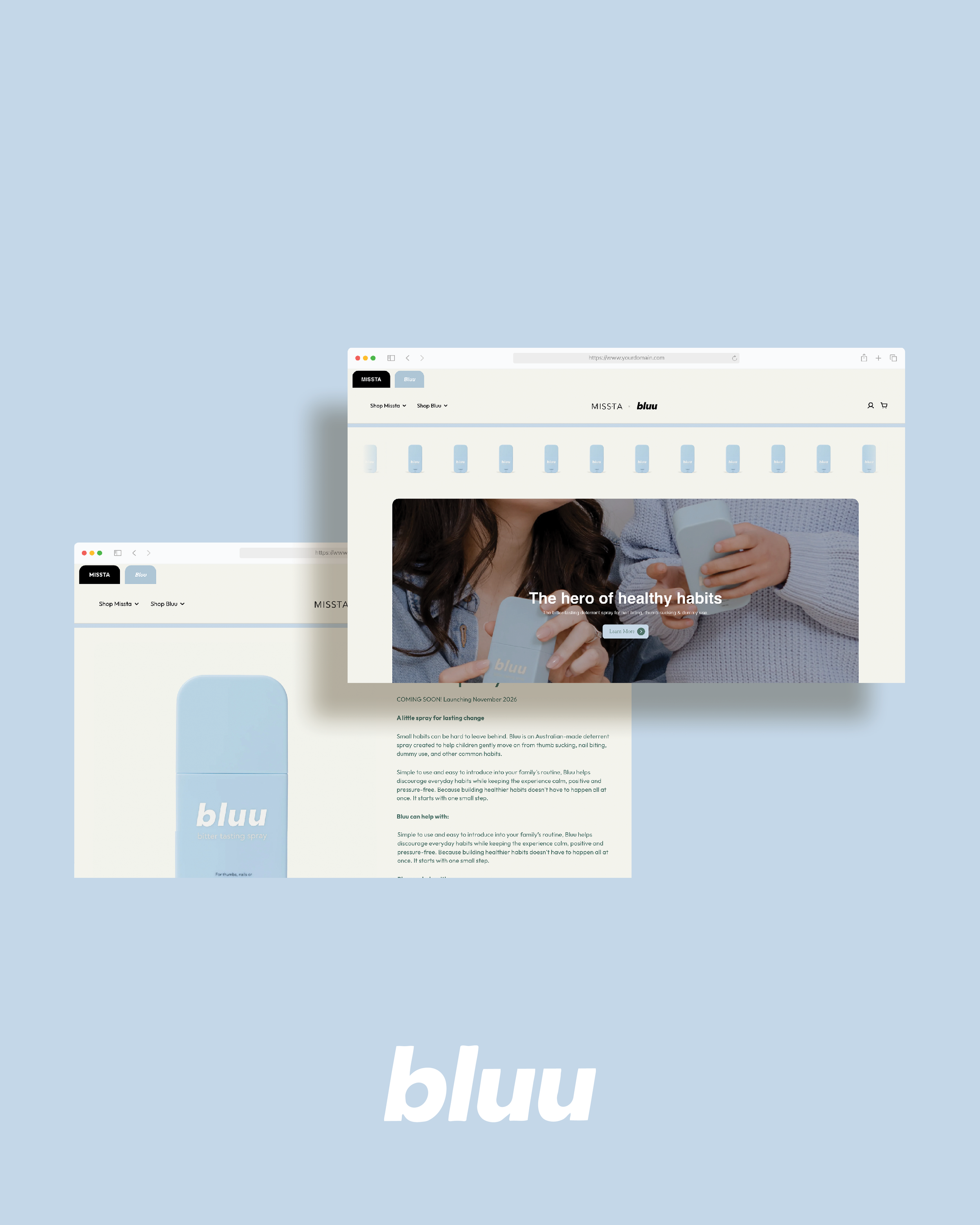
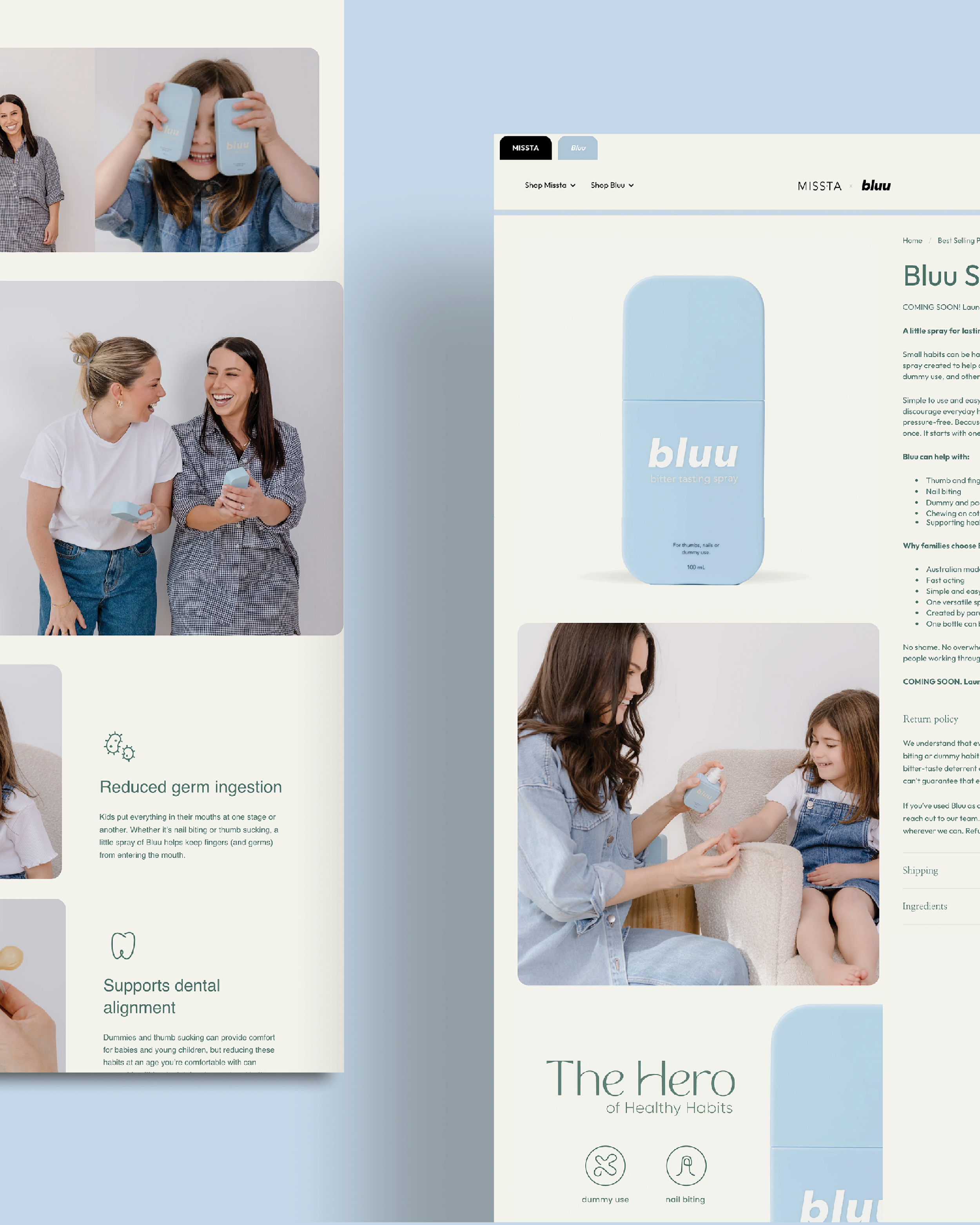
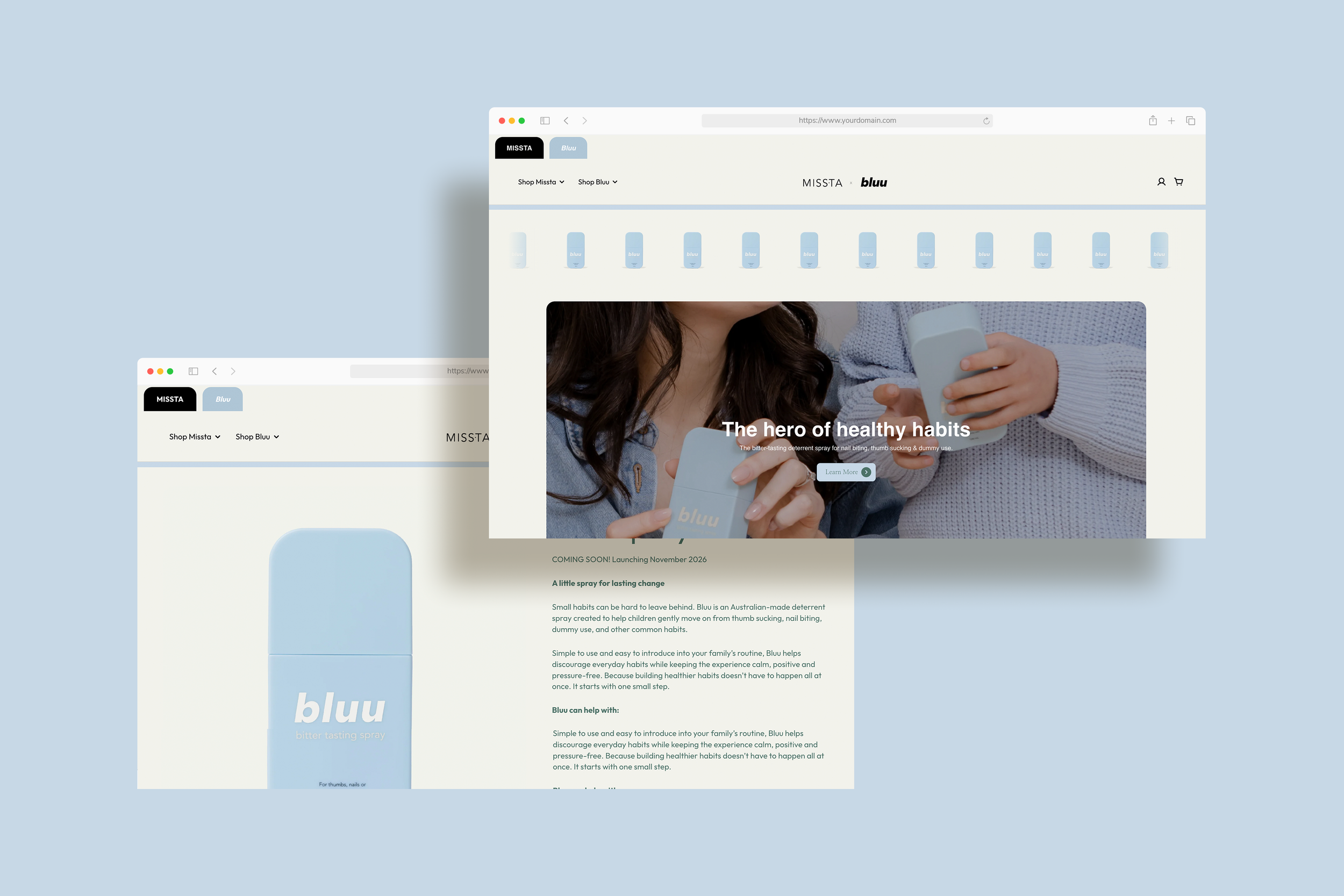
Two sister brands, one Shopify storefront. Bluu needed its own space within the Missta website, with a clear way for customers to move between them.
I custom coded brand tabs at the top of the site, making it easy to switch between Missta and Bluu.
Along with being navigationally seamless, it visually needed to tie into Missta as a brand family, whilst still feeling unique in it’s own right. I did this by having Bluu & Missta share a core brand colour & heroeing clean space across both of their sites.
Then we have the details. I made sure every image had a slight curved corner, mirroring the curve of the Bluu product bottle. Little carousels of the products scrolling instantly gave it a sense of play without feeling childlike, and the copywriting was written to be SEO optimised as well as educational and nuturing.
THE KINDEST OF WORDS
“Where do I begin with Eden? She is talented, organised, caring, pays attention to the most fine details and treats you like you are her only client. I get shocked (and weirdly I feel slightly cheated on) every time I see Eden post on social media that she has other clients because I can't fathom she has any effort left in her system after working on our projects!
We originally worked with Eden for one project and now rely on her for everything, we can't imagine our business without her! She is spectacular and worth quite literally every single cent. Eden made me realise how much work a graphic designer actually does and it goes far beyond what I thought.
I recommend her to anyone who will listen to me! Thank you Eden, you are a superstar!!!”
Mel, Co-Founder of Bluu / Missta